
Build a Screen from Scratch
When building experiences, the best place to start is always the screen library. But, while the options there give you plenty of ways to get started, we know that you want to customize your screens beyond what’s offered in the screen library. That’s where design elements come in.
Video Tutorial
Step by Step Guide
From the screen you want to edit, select “Add Element” from the left navigation menu. This opens up a sub-menu of elements you can add.
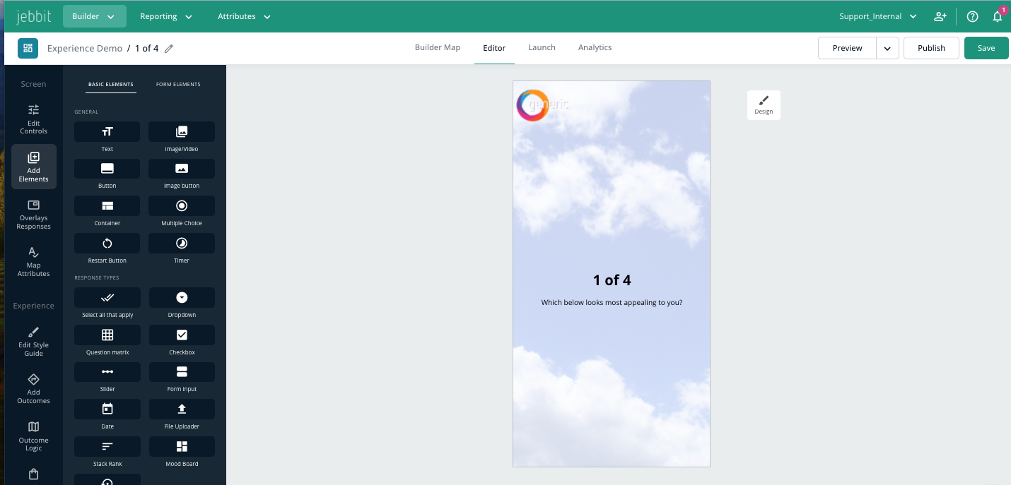
You'll notice headers for Basic Elements and Form Elements. Within Basic Elements, you'll find sub-categories for General, Response Types, Outcomes and Sharing. When you click into the Form Elements header, you'll find more specific form elements that you can use to further customize forms based on the data that you want to collect. Below is a full list of design elements:
Basic Elements/ General
Text: Non-interactive text to provide detail to users.
Image/Video: Non-interactive photo, video, or gif to add context, humor, etc.
Button: Adds a button in the primary styling specified in the experience’s Style Guide. Learn more about Style Guides here.
Image Button: Allows users to answer a question by clicking/tapping on an image. Can also include text.
Container: Allows you to create groupings of design elements.
Restart Button: Allows users to be taken back to the start of the quiz.
This is particularly useful for campaigns embedded on-site via iframe, as the user can return to the start of the Jebbit experience without needing to refresh the entire page!
Basic Elements/ Response Types
Select All That Apply: Allows users to select more than one response on a screen.
Dropdown: Allows users to select an answer from a dropdown list.
Question Matrix: Allows users to respond to multiple questions with a range of different answers in a table format.
Checkbox: Allows users to submit responses via a checkbox. Commonly used for opt-ins.
Slider: Allows users to select an answer based on a sliding scale.
Form input: Allows users to type an open response into a text field.
Mood Board: Mood Boards allow you to create stunning visual experiences that are interactive and fun!
Spinners: Spinners give your audience an engaging way of interacting with your brand. Try an example, HERE!
Screen Timer: Adding a screen timer to your campaign opens a world of possibilities to further engage your users. You can learn more here.
Basic Elements/ Outcomes
NOTE: Outcome elements are dynamic elements. These elements allow you to show different things to different users based on the information that you fill in on the 'Add Outcomes' screen.
Heading: Provide the name of a specific result a user reached. Learn more about Outcomes here.
Description: Provide a description of a specific result a user reached. Learn more about Outcomes here.
Image: Provide a picture to accompany a specific result a user reached. Learn more about Outcomes here.
Products: On your outcome screen, you can add additional product recommendations which is a powerful way to showcase numerous offerings on your website at one time. Learn more here.
Basic Elements/ Sharing
Social Share: Allow users to share the experience on social media.
Facebook Login: Allows users to log in using Facebook for identity verification.
Google Login: Allows users to log in using Google for identity verification.
Form Elements
NOTE: The majority of the elements that you'll find within the Form Elements menu are pre-labelled for use exactly as you'd expect. A couple of elements to note from this sub-menu are:
Create Your Own: This is another way that you can customize a unique text input field.
Text Within Form: This allows you to easily insert text within a form container.
Long/Short Open Response: Open responses can be made long/short depending on how long of a response you are expecting from the user. If you are asking a question like "Describe your first time at the ballpark," you will want to set the input size to 'Long.' If you are asking for a shorter response, set the input size to 'Short.'
Tip: You can make a form field required by clicking directly into the form element and making sure the 'Required' setting form the left hand menu is checked off. If a form input should be optional, then you would simply uncheck the 'Required' setting.
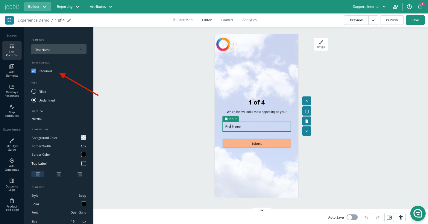
Once you’ve added a new element, you can edit it using the menu on the left. Use the blue arrows to change its position on the screen, and click the blue trash icon to delete it.

Check out the video below for some tips on design best practices
Related Articles
Keywords: design, elements, editor, screen edits, features