
Brand Dashboard Overview
For the most all-encompassing look at performance across your Jebbit campaigns, pay a visit to your brand dashboard. There are a variety of sections that make up this dashboard, and you have the ability to make your data more specific through a variety of filters. This article will break it down!
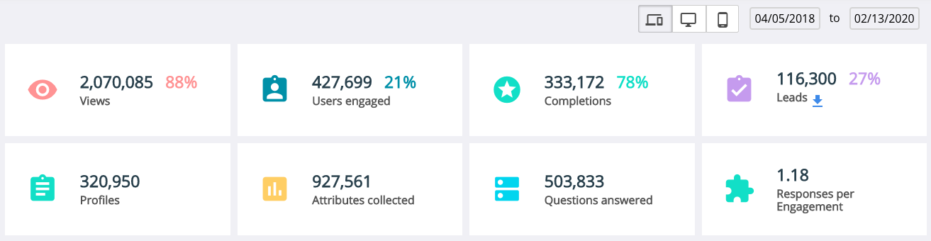
Overview
To find your Brand Dashboard, click into the Reporting menu. Your Brand Dashboard will be the first menu option on the left! At the top of the screen, you’ll find the totals of all the most important performance metrics aggregated across all your experiences. For a more specific view of your data, you can filter aggregate results by device type and date range. These metrics serve as the basis of your business-wide benchmarks!
Need a refresher on what these metrics mean? Check out our glossary here.
Metrics Graph
Beneath the brand performance metrics, you'll find a graph allowing you to view any specific performance metric over time. This is a great place to analyze the performance of your experiences.
Don’t forget to filter the graph by the metric most important to you (Loads, Views, Users Engaged, Completions, Lead Captures).

Top Experiences Chart
Underneath the Metrics Graph on the left-hand side, you'll find a list of your top experiences, in terms of volume of user traffic. You can quickly visit the Experience Dashboard from any one of the top experiences by clicking on the experience name.
You can also visit the full list of your experiences by clicking on "Go to experience list", which will take you to the Experience Analytics page.

Channel Breakdown
Finally, you’ll find a Pie Chart in the bottom right with filters depicting total volumes broken down by channel. This is a fantastic way to quickly analyze which channels drive the most volume of any selected metric you’re looking to maximize.

Related Articles
Keywords: performance, metrics, aggregate, data, brand reporting