
Mobile vs. Desktop
Jebbit experiences can be viewed on any device type, so Jebbit gives you the option to optimize the style of your experiences for mobile and desktop devices separately. Whether you intentionally optimize content for devices types or not, Jebbit experiences are responsive so the content will always try to fit within a user's screen in the most optimal way possible.
Video Tutorial
Step by Step Guide
Open up the Screen Editor by clicking on any screen from the Builder Map view.

Within the Screen Editor, locate the 'Mobile' and 'Desktop' toggles on the left hand menu.

This toggle is meant to give you a glimpse of how your content will look on both mobile and desktop devices. By default, any changes that you make on the mobile view will be automatically applied to the desktop view.
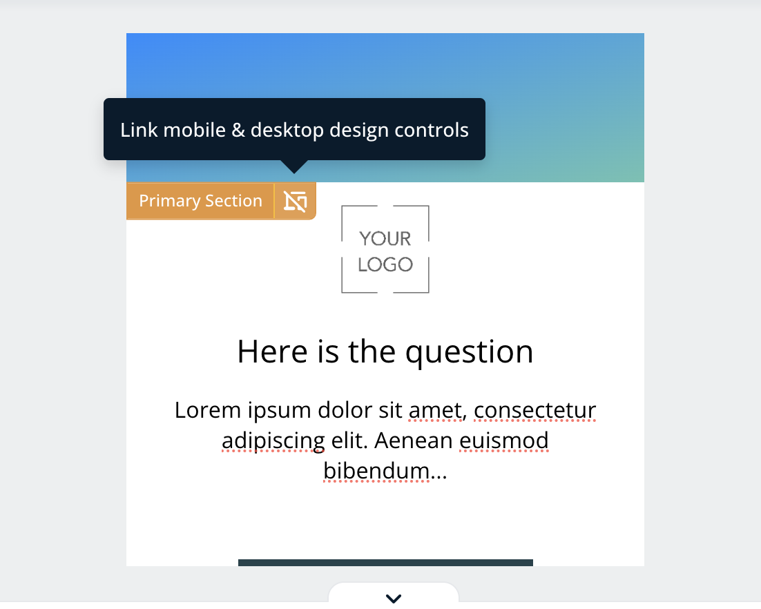
You will note that individual elements can now be linked or unlinked by clicking the device icon — you can make changes to both screen views simultaneously, or just to one using this feature. Simply hover over each element to determine whether they're linked or unlinked, then toggle between mobile and desktop views to make independent changes.
Frequently Asked Questions
Q. Can I have different layouts on mobile and desktop?
A: Yes! You have the option to toggle between different layouts for both mobile and desktop designs. You can also control the layout of individual elements by linking or unlinking changes, as shown in step 4 above.
Related Articles
Keywords: mobile, desktop, view, edits, screen, design, style independently