
Best Practices: Adding Images
Adding imagery to your campaign is without a doubt one of the keys to an engaging experience.
Creative Spec Sheet
The first stop you should make when creating any experience is the Creative Spec Sheet. This is a comprehensive guide that provides the exact dimensions of each kind of visual element you can add to a campaign. Image buttons, split screen layouts, background images and more are all covered.
You can access the Spec Sheet from one of two places:
Click the "Design" tab from the Builder Map. (It looks like a paintbrush!) From there, select "Download Creative Specifications."
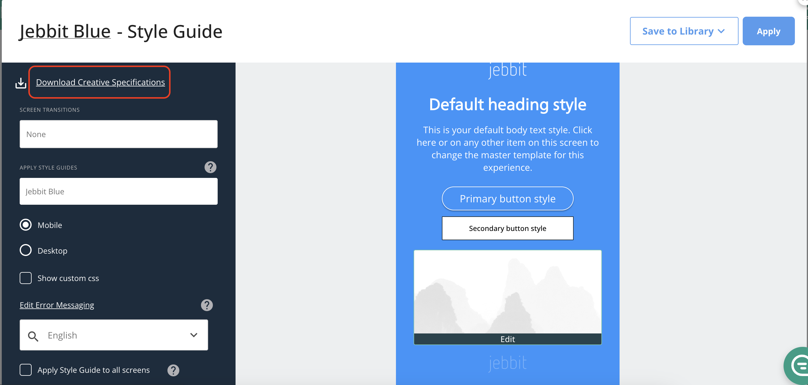
You can also click the dropdown menu featuring your brand name in the upper righthand corner of the Jebbit builder. From there, select "Settings." This will immediately bring you to the Media Library, where you can select "View Creative Specs."
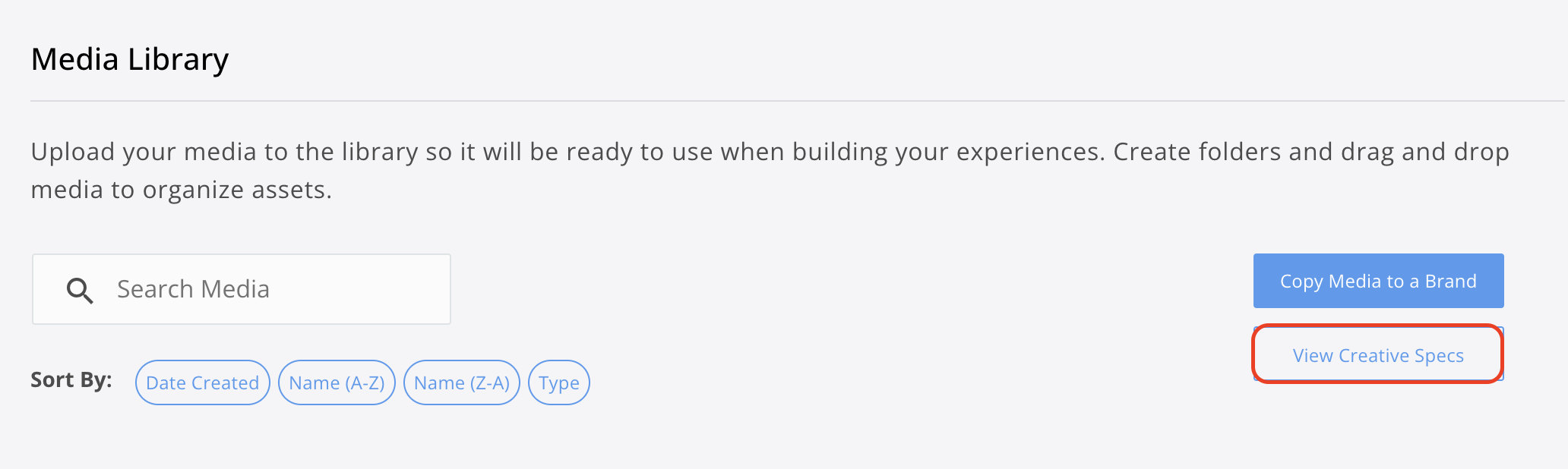
Image Buttons and Size Mode
When adding Image Buttons to your campaign, it's best to keep the file size around 300kb for optimal display and load times. The minimum resolution should be at least 600x600, with square images being the best choice, with the content of the button centered.
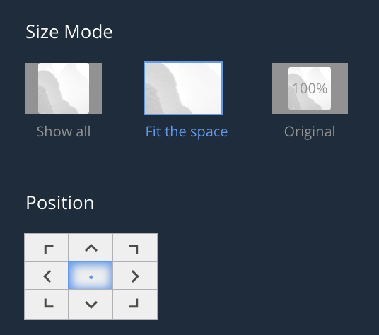
If you're having problems with how your image buttons display, the "Position" and "Size Mode" controls are the first thing you should experiment with.
The "Position" matrix allows you to select which portion of the image to display prominently, while the "Size Mode" allows you to select between three options: "Show All," which displays the entire image to scale; "Fit the space," which scales the image to the button itself; and "Original," which displays the image at its original resolution.
"Show All" is best for when you don't want any cropping whatsoever. "Fit the Space" is best for when you want the asset to fill the space regardless of the size of the user's device.
Split-Screen Layout
Split-Screen design specifications can be found in the Creative Specs. The suggested resolution is about half the width of standard background image resolutions.
Split-Screen layouts tend to look best on Desktop. However, they can cause difficulties for mobile users. In this case, it's best to turn on "Style Independently" and use a different layout for mobile.
Adding Alt-Text
Alt text is crucial for your experience to remain ADA-compliant. Alt text provides a description of the imagery on your screen. This is particularly helpful for readers who cannot see, as they can be provided a description of what is shown.
Alt text is only necessary when 'the image contains information.' If an image is purely decorative, like a background image, then alt text is not needed.
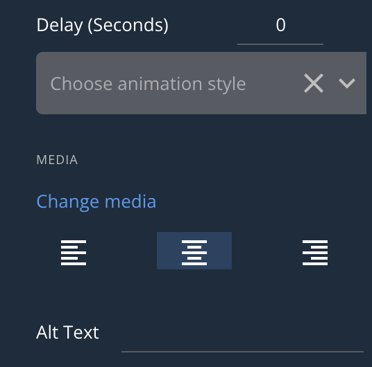
You can add alt text by selecting the image you've added to the campaign, then scrolling on the lefthand panel until you find the alt text field.
Related Articles
Styling Mobile & Desktop Views
Keywords: alt-text, accessibility, image button, split-screen, size mode, creative specs