
Jebbit strives to ensure that all content created on our platform adheres to WCAG 2.2 Level AA Compliance. However, given we are a creative platform, there are steps/precautions that need to be taken by our users to ensure compliance.
To make this process easier we've added an ADA checker that checks for two specific errors: color contrast and alt text. Both are explained below!
Video Tutorial
Step-by-Step Guide
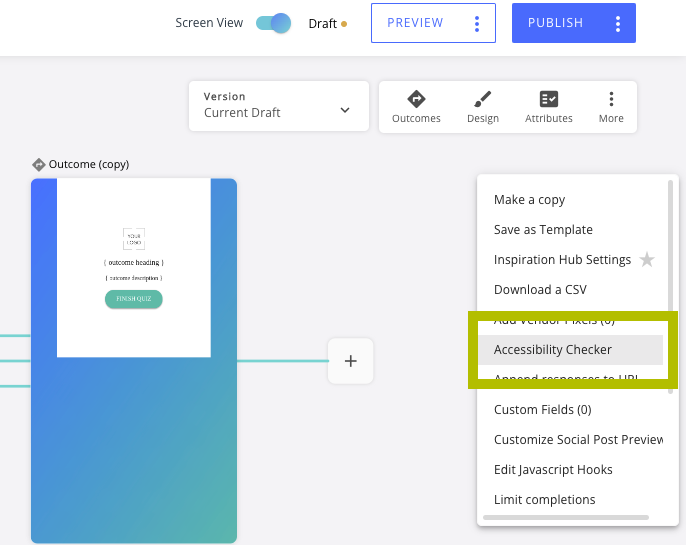
Finding the Accessibility Checker:
Navigate to the three-dot "More" dropdown menu in the builder map.
Click "Accessibility Checker." This will bring up a checklist of items to address before publishing.

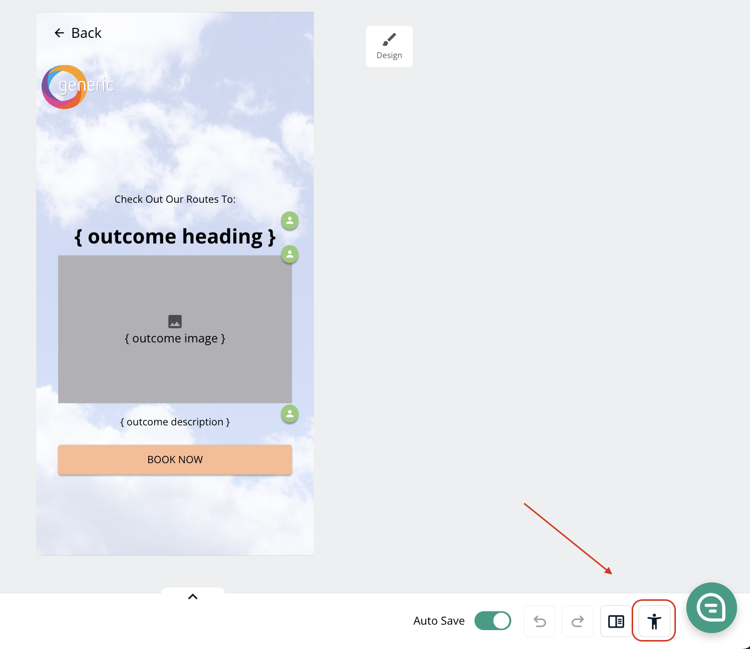
The Accessibility Checker can also be found next to the Undo buttons inside the screen editor itself.

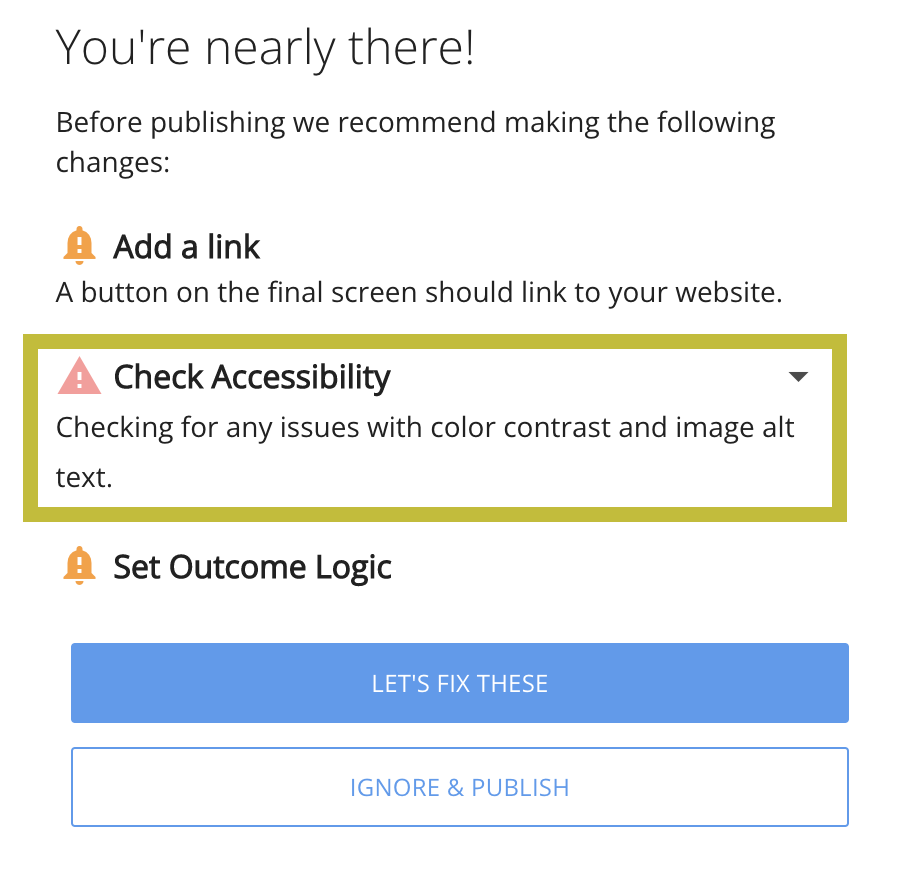
Finally, clicking "Publish" will automatically pull up a list of any accessibility issues.

Resolving Alt-Text Issues:
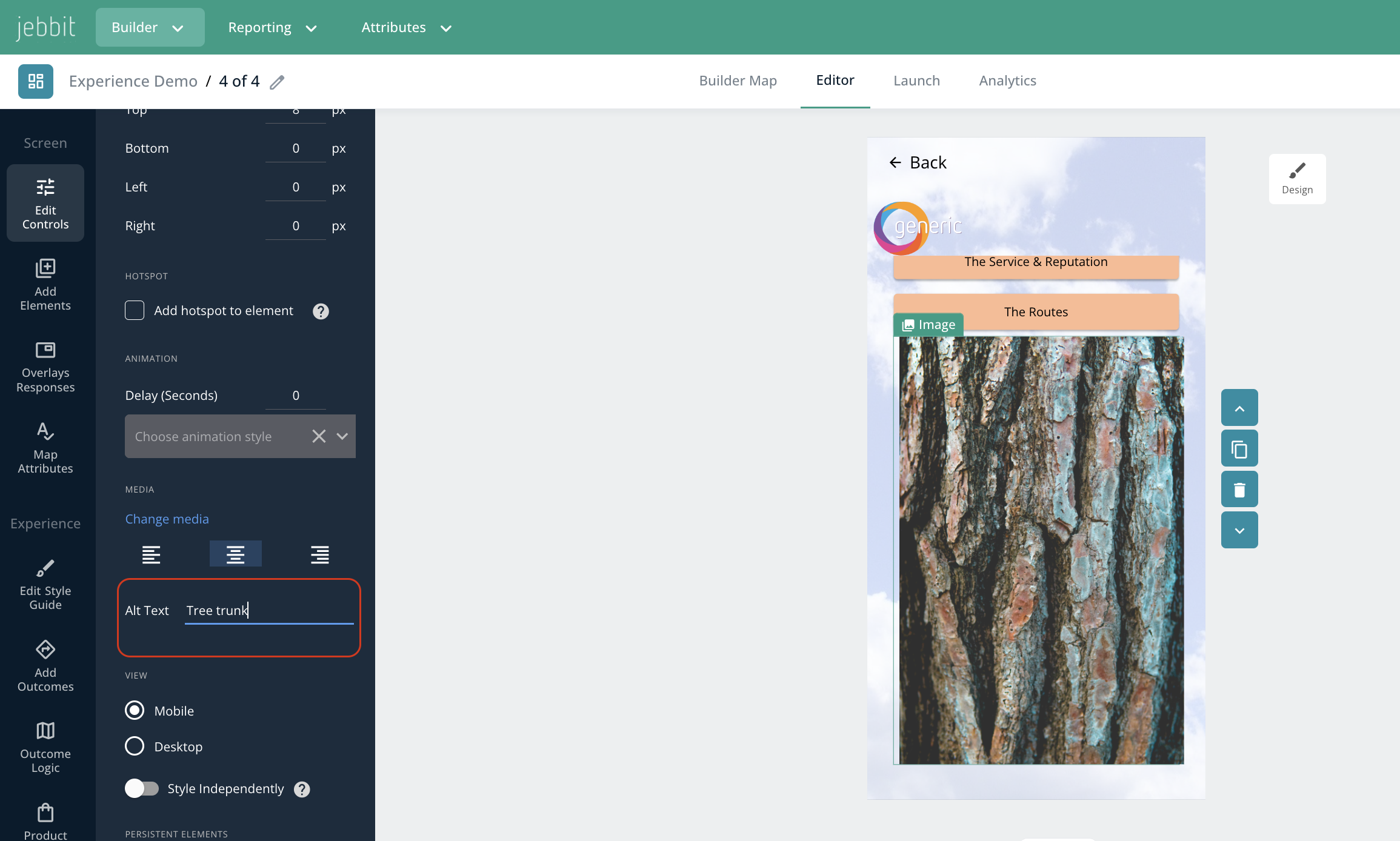
Navigate to the image(s) that are causing accessibility issues per the Accessibility Checker.
Click the Image element.
Navigate to the lefthand panel and find the field that reads "Alt Text." Add descriptive, concise text explaining what's contained in the image for users who are using screen readers.

Resolving Color Contrast Issues:
Button Text has a color contrast issue: this means the text of your button, against the background of your button, is not compliant. Adjust either the button text, or button background color to ensure compliance.
Button Background has a color contrast issue: this means the background color of your button against the background color of the screen is not complaint. Adjust the button background color or the screen background color.
Button Text & Background have color contrast issues: this means both the background color of your button against the screen background, and the text of your button against the button background are not compliant. How to solve for these is spelled out above.
Body Text has a color contrast issue: this means there is body text on your screen that is unreadable against the background color of the screen. Adjust the text/background color to oblige.
Heading Text has a color contrast issue: this means there is heading text on your screen that is unreadable against the background color of the screen. Adjust the text/background color to oblige.
Frequently Asked Questions
Q: What is the function of alt text?
A: Alt text provides a description of the imagery on your screen. This is particularly helpful for readers who cannot see, as they can be provided a description of what is shown.
Q: When is alt text necessary?
A: Alt text is only necessary when 'the image contains information.' If an image is purely decorative, like a background image, then alt text is not needed.
Q: Can I add alt text to a secondary background image?
A: Presently we do not have this capability, however new accessibility-related features are released regularly, so stay tuned!
Q: I have a color contrast issue — why is that a problem?
A: Proper color contrast is necessary to ensure your content is readable by all users. Specifically, ADA compliance states that the contrast between the text and background must be greater than or equal to 4.5:1 for small text and 3:1 for large text. You can use this tool to check your color contrast ratio!
Q: What is the best practice for accessibility pertaining to forms?
A: When setting up a form for lead capture or anything else where a user will be inputting information, we recommend toggling on the "Top Label" function. This will allow the field description to appear above the form field when users begin typing. You can apply a Top Label to both "Filled" and "Underlined" forms.