
Building a Lightbox
Most brand's use pop-up content to offer discounts in exchange for emails when users visit their site. With Jebbit, you can take something that everyone is doing and make it better! Build out complete quizzes or simply ask your audience a few questions with our Lightbox tool. Turn a pop-up into an opportunity to engage your audience, collect valuable first party data, and sustain more genuine interactions with your audience over time.
Video Tutorial
Step by Step Guide
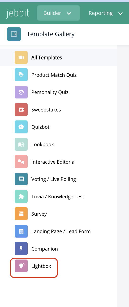
From the Builder tab dropdown, navigate to "Template Gallery."

To begin building a Lightbox, you must start by selecting a Lightbox labeled template from the Experience Gallery. Click on 'Lightbox' from the left hand menu.
Select a Lightbox template over your choice by hovering your mouse over the template and selecting 'Use Template'
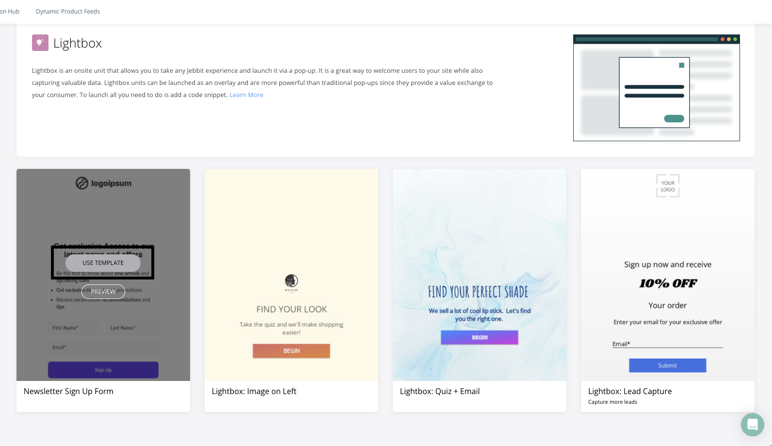
You will be brought to the builder map where you will be able to edit and style your Lightbox, just as you would for any other standard experience!
Frequently Asked Questions
Q: Can I do a split screen layout for mobile?
A: We don't recommend setting up a split screen design on your mobile layout. This is because a split screen layout for mobile isn't an optimal use of the small space that you have to engage your audience. You can use a split screen design for your desktop layout.
Q: There's too much scrolling in my experience. How do I optimize my design for Lightbox?
A: The best way to reduce scrolling on a Lightbox is to make the content on your screen smaller. This means reducing font sizes, and moving buttons into columns. You can move buttons into columns by adding a Container element to the screen, and then adding the buttons into the Container. If your buttons were not in a Container to start, then you'll need to delete the old buttons when you add new ones into the Container.
Q: Can the size of the Lightbox be changed?
A: There is no way to modify the size of the Lightbox unit. With that being said, all Jebbit experiences are responsive so the unit will resize automatically based on the size of a user's screen for an optimal user experience.
Related Articles
Keywords: lightbox, pop-up, pop up, onsite, website