
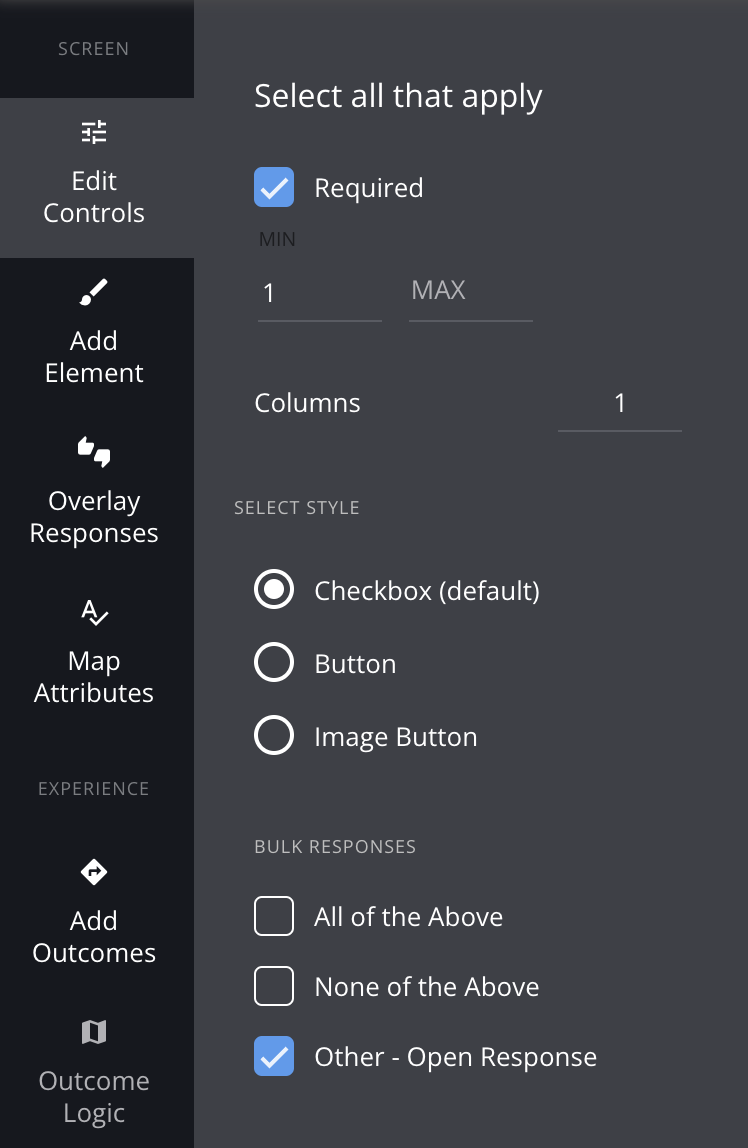
Select All That Apply is a powerful element type which enables consumers to select multiple items on one screen. This element comes with a whole host of functionality to make your experiences engaging, but also flexible for how you collect the data.
Overview
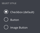
Button Types & Checkboxes
There are 3 button types you can use within your Select All That Apply container.
Checkboxes
Buttons
Image Buttons
None/All of the Above
You can easily add a 'None of the Above' or 'All of the Above' option to your container. It acts exactly as you'd expect. If the consumer selects 'none of the above' all the other items will be unselected. Check out how it works here.
Add an "Other" text input
Select the "Other - Open Response" checkbox to add an open response field for your customers to enter their own answer. This is great for uncovering new customer insights. For example, if you're asking "What sleep concerns do you have?", instead of limiting the user to your pre-defined options, adding an open response field will allow the customer to tell you what you may be missing.
Note that "Other" will only work with Checkbox-style SATA. For an open response on Buttons or Image Buttons, you can add a separate form element for Open Response beneath your Select All That Apply element.
Min/Max Requirements
You can set minimum and maximum requirements for your Select All That Apply questions. For example, if you set a minimum of 2, the end-user must select at least two choices before they can move on. Or, if you set a maximum of 2, the end-user will not be able to select more than two answer choices - if they do, they will receive an error message that prompts them to select within the range.
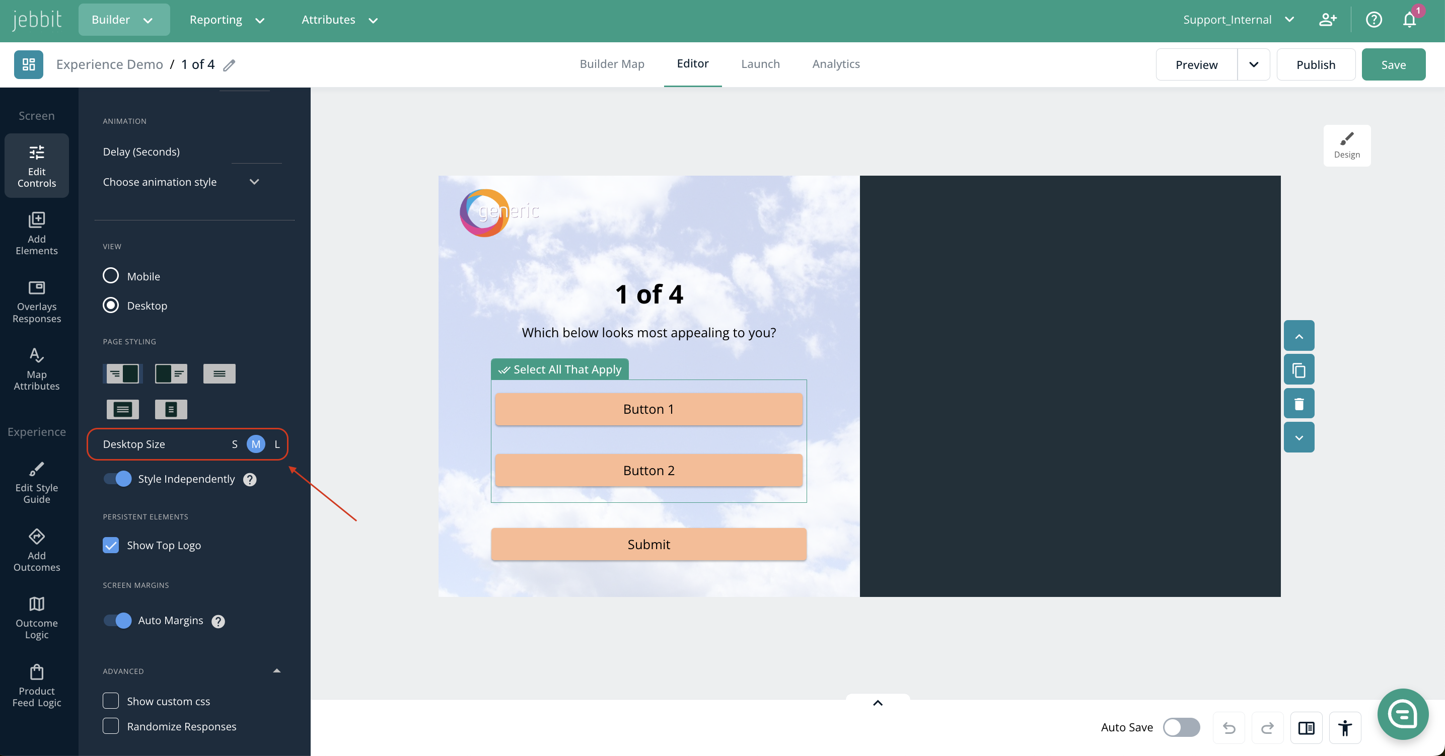
Desktop Layouts
To optimize screen real estate on desktop, use style independently, which allows you to have different layouts for desktop and mobile You can use columns and desktop size controls or just set the button width to have the builder align your buttons. Check out how it works here.
Columns - select the number of columns you want to display
Desktop Size - adjust the size of the elements on the screen
Sizing - just set the button width and we will automatically align the buttons

Branching
You can create personalized consumer experiences via branching for Select All That Apply items. We provide the flexibility to create a branch based on a combination of items and you can even weight which path to take the consumer down in the case of a tie. Learn more here.
Pixel Support

Reporting
Within Question Analytics you can easily tell which screens have form fields and the type of form field. In the case of Select All That Apply you will notice a label where you can see the breakdown of your responses.
Additionally if you wish to export a CSV of the data you have the option of how you would like to view the data. You can either view multiple items in one cell, or each item can be it's own column in the CSV.

Frequently Asked Questions
Q: Is it possible to cap the number of selected options on a Select All That Apply form?
A: You can set minimum and maximum validations on your Select All That Apply form in Jebbit! This would allow you to cap the number of responses a user can submit. To add validations, you first have to set your SATA form to "Required."
