
Video Explanation (~1 minute)
HTML
Some text elements in the builder allow you to access and edit their relative HTML. If you select an element and click the “</>” icon you'll be given an editor window:
![[video-to-gif output image]](https://usw2.frontkb-cdn.com/attachments/7023564/321/de0881dd-d63e-4a56-8b45-2a020e070475.gif)
CSS
You can add CSS either locally or globally within a Jebbit experience.
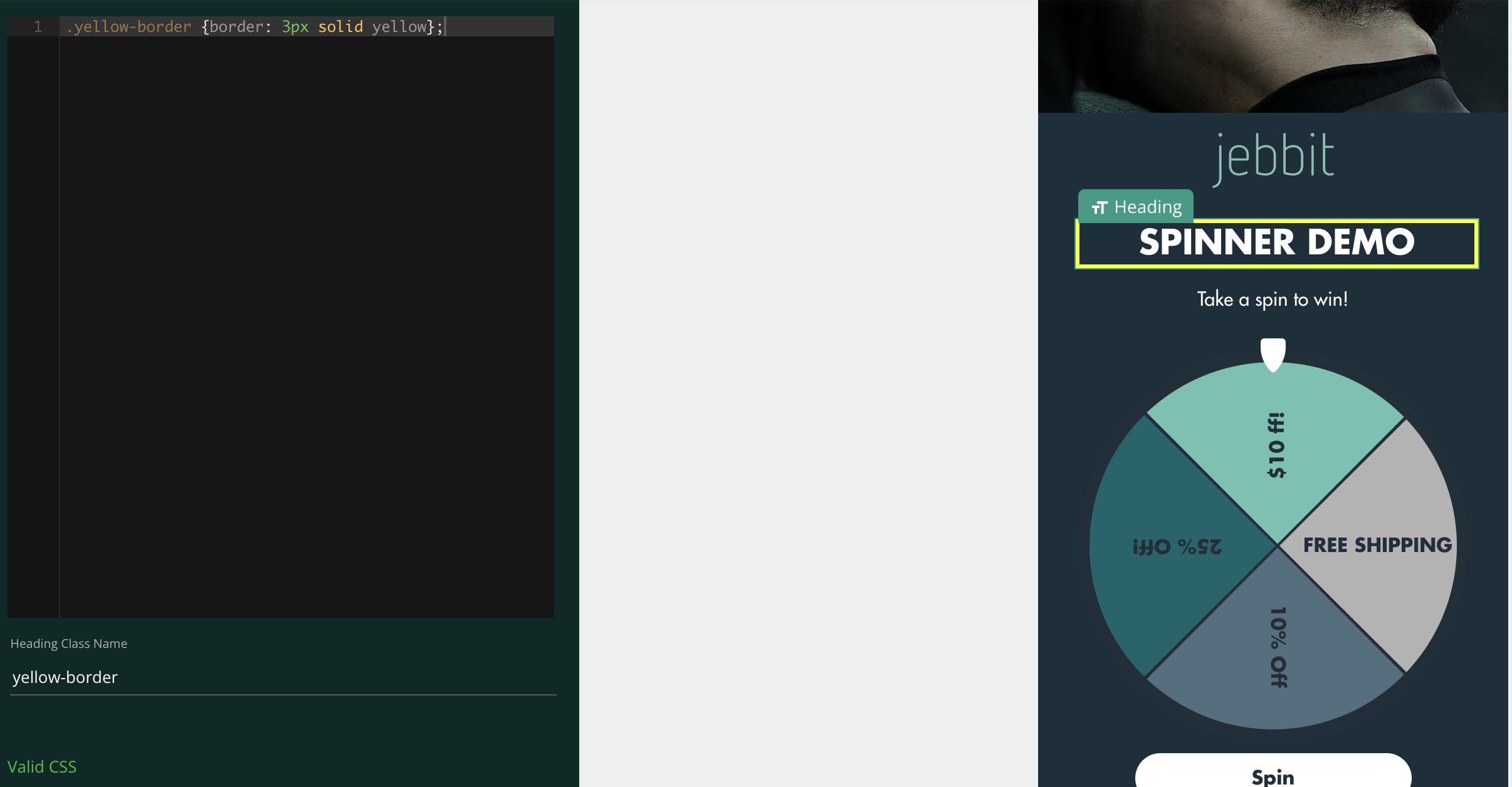
To add local CSS, navigate into a particular screen's editor and select “Show custom css".

Checking this box will open an editor where you can target elements and customize them using CSS or SASS.
To set a custom class
If you select an element in the Editor, a "Class Name" text input will show that will allow you to set a custom class. This is the most reliable way to target an element.
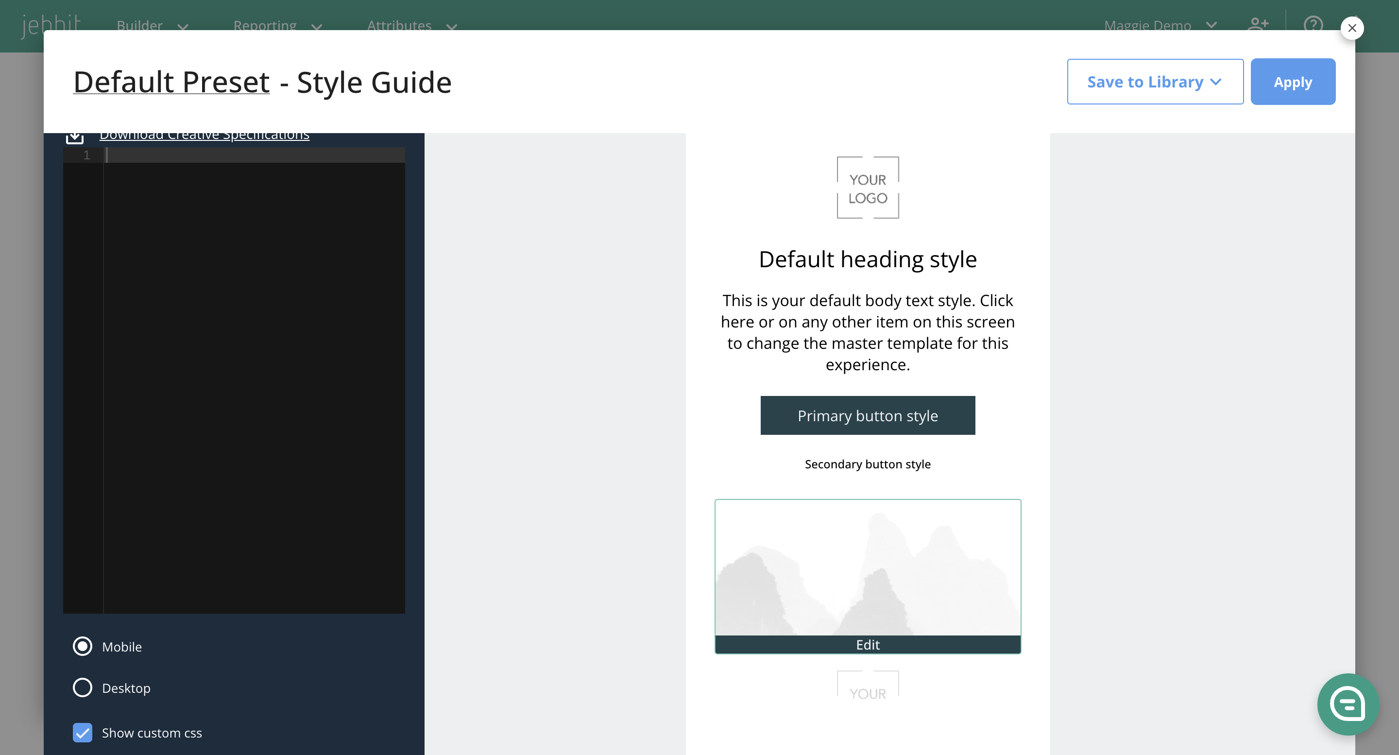
To access global CSS, click the design button in the top right of the builder map and toggle "Show custom css". CSS placed here will apply to all the screens in an experience.
Main Classes
When adding elements to a screen, classes will be assigned by default. Let’s take a look at this sample screen:

...and add some labels:

Here you can see general class labels as they’ve been written into the image.
The main content block you’ll be working with is “content-block-inner”. As you can see, this contains most of our page’s elements aside from the logo. The logo is given its own wrapper “campaign-logo-wrapper” and is a sibling of “content-block-inner”. Both of these are children to the main parent class “content-block-primary”, which essentially contains most everything on a given screen.
Now that we understand some of the general, encompassing classes, let’s take a look at individual page elements. Added elements will always follow the naming convention: “content-piece-wrapper-x”, with “x” being the numerical placement. The first, top-most, element is 0 and then each subsequent container is incremented by 1.


Class examples while inspecting
Container/Column Structure
The Jebbit builder gives access to container elements. Let’s take a look at how classes work within. In this example we’ll look at a two column container:

Each column contains two buttons and is labeled with “column-wrapper”, and “column_0” and “column_1” respectively. Each button is given its own class wrapper that contains its own position and its parent column’s position. So “Button B” being in column “0” and being the second button in that column, leads to its label being “content-piece-wrapper-column_0-1”. If we added an additional column, the next class would be “column-wrapper column_2” and so on.
![[video-to-gif output image]](https://downloads.intercomcdn.eu/i/o/a313kgje/35897923/d3f729603f99f62e0b13c74cf489/d3728aed-6d69-48a4-bc83-11282def67ca.gif?expires=1740709800&signature=f79962f2f52a7f3bbd84b8e3d7b55f3bbf3f76b38fa3305676aa6baa8c62e758&req=09BnzF%2FzrjRk2hL085Zhobqi4n2VT8p7zT3DrR%2FoBe8xe%2Bywuf4VMc4IZ8WY%0Aol57R3RHfCiGfWuU%0A)