
Most Common Use Cases
box-sizing
Video Explanation (~3 minutes. 1.5x speed recommended)
The box-sizing property for all elements is set as "box-sizing: content-box;" by default. It’s important to note what this means and how it affects your elements. Let’s look at a basic example:

Here we have two containers set up the same way except for their box-sizing properties. The main difference to note is that the padding being applied overflows for the one set with “content-box”, and the padding for the first is being applied to the element internally. Technically “content-box” is the default property and doesn’t need to be written on line 24. It was simply added for the sake of demonstration, but removing it would give us the same result:

Full Bleed Images
Video Explanation (~4 minutes. 1.5x speed recommended)
There is currently no builder toggle for full bleed images, but we can accomplish this with some simple CSS. You will need to target the image and define its width as 100%:
.content-piece-wrapper-x .image{
   width: 100%;
}
And then target the inner content block. Jebbit has some margins set by default, so we can overwrite them here and set our width to 100%:
.content-block-inner{
   width: 100%;
   margin: auto 0px;
}
Edits after already applying CSS
This is recommended only if you cannot set a custom class on the element.
Video Explanation (~2 minutes. 1.5x speed recommended)
If a screen contains custom CSS, it’s important to note how this will affect existing builder elements if additional edits are made. Let’s take a look at a simple example. Here we have some CSS applied to content-piece-wrapper-1 making the background color red:

If we then change the element's position, we will see the following:
![[video-to-gif output image]](https://usw2.frontkb-cdn.com/attachments/7023564/321/10c9ebae-018e-4bb0-9749-17b41cba791a.gif)
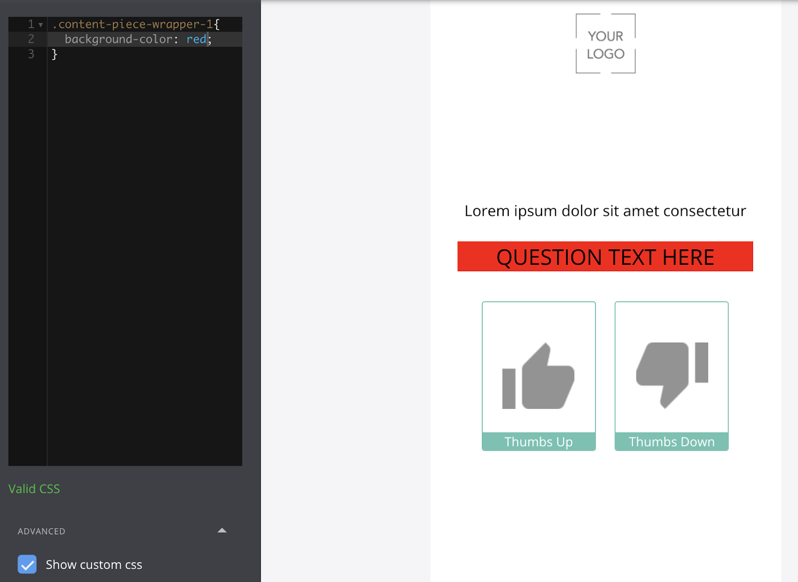
Note that while we didn’t modify our CSS, the styling now applies to “QUESTION TEXT HERE”, as it’s now adopted the “content-piece-wrapper-1” label, and our “Lorem ipsum” text has taken on “content-piece-wrapper-0”.
Considering this type of scenario, we would often recommend that a screen be fully configured with the desired builder elements before adding custom CSS. This will help minimize potential error and prevent you from having to reconfigure existing work.
Ember Generated Class IDs
Video Explanation (~4 minutes. 1.5x speed recommended)
When working with custom CSS in Jebbit, it’s important to note class IDs that are generated per project iteration by Ember (unless you have set a custom class!). We can look at the following example:
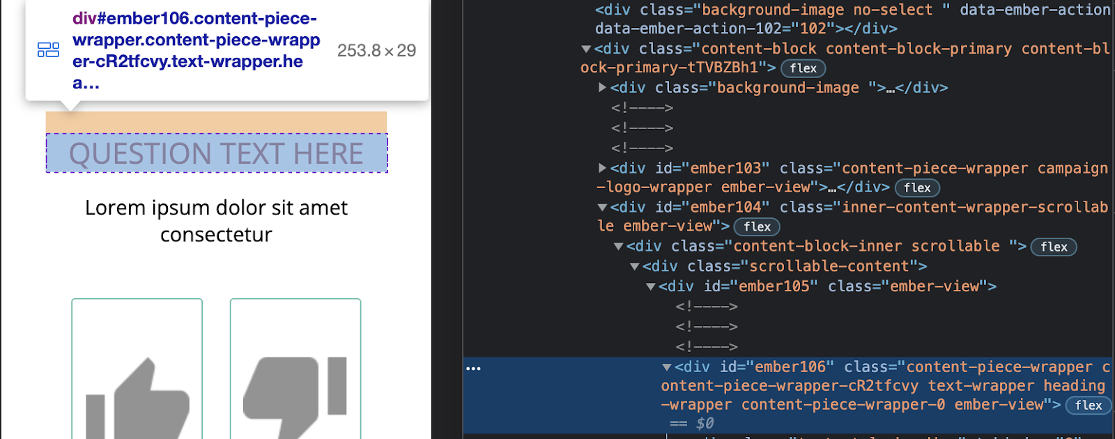
You may notice when inspecting certain page elements, that you’re often given a class ID of “content-piece-wrapper-”, followed by a string of seemingly random characters. In this example we have "content-piece-wrapper-cR2tfcvy":

While it may initially seem like you can call on these classes, you will want to avoid these entirely. Instead, you would want to refer to “content-piece-wrapper-0” in this example. This is because the other class name in question will technically change anytime the experience is published. So while it may appear to work to begin with, your CSS will not apply to the newly generated class names as they are created. See video for a more detailed explanation.
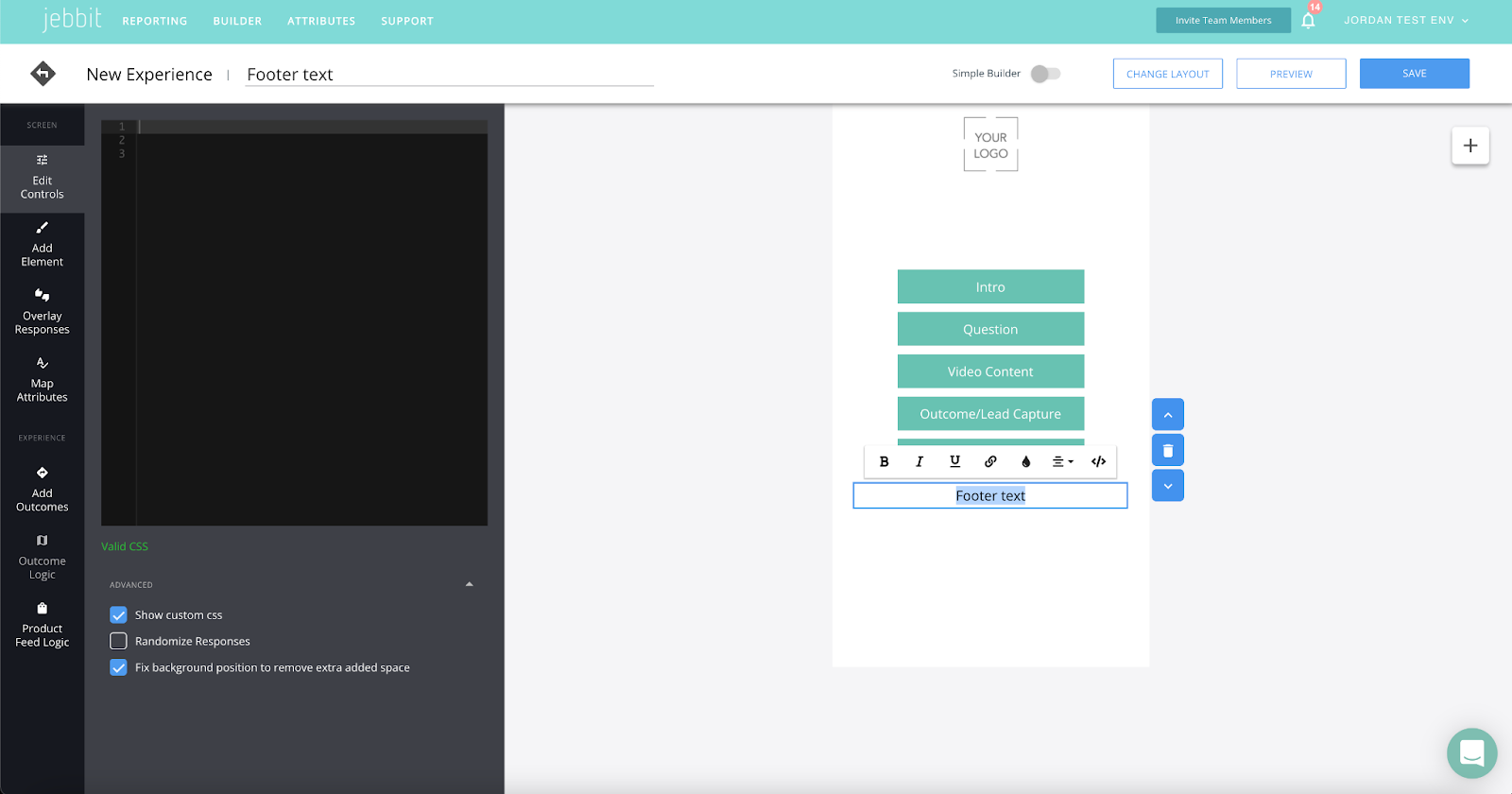
Using Fixed Positioning
Video Explanation (~4 minutes. 1.5x speed recommended)
NOTE: Jebbit has in-platform tools to anchor a logo to the bottom of the screen. You should never have to use fixed positioning to accomplish this. This example is mostly to show the behavior of the fixed display property within the builder
You may notice when using fixed positioning in the builder, that the fixed style seems to apply to the entire browser window:
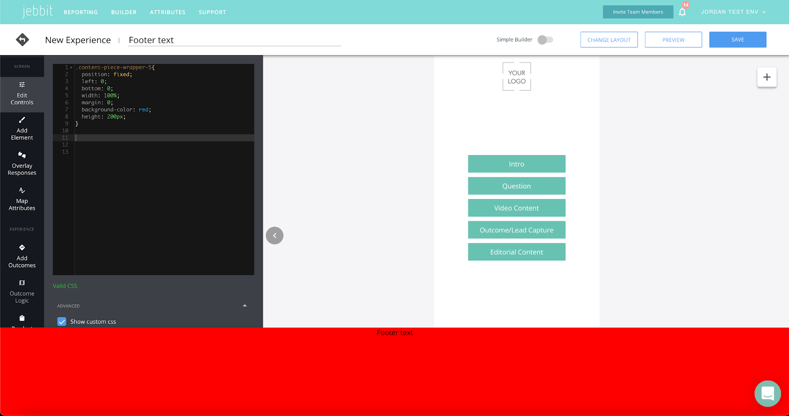
While I would generally discourage using fixed positioning for this reason (absolute is much more Jebbit-friendly), there is some CSS we can use to only add styles that reflect in the builder window:

or

If you add “active” and “not-active” to your selector, you can then add CSS that will only apply when working in the builder window, but not when previewing. See video for a more detailed explanation.
.active.YOURCLASSHERE,
.not-active.YOURCLASSHERE{

     STYLINGS HERE WILL ONLY APPLY IN THE BUILDER WINDOW

}